
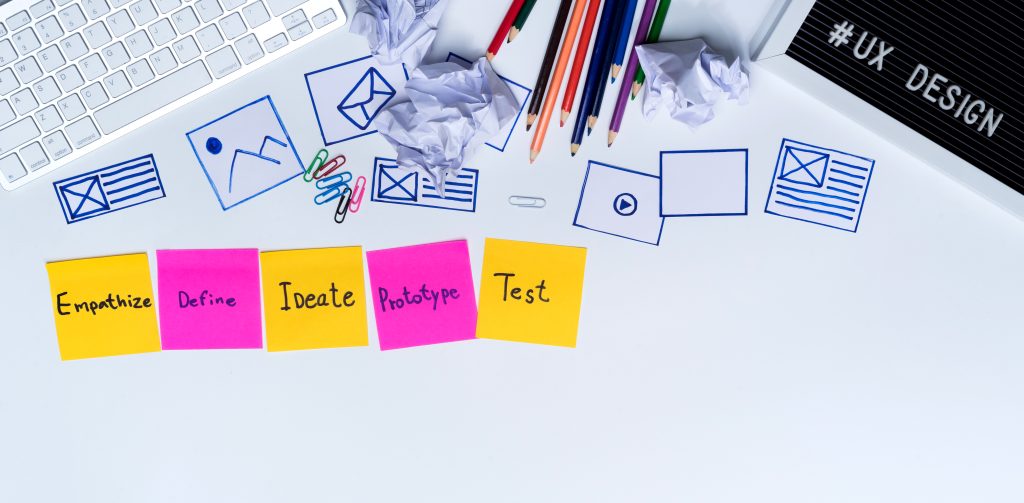
Website projects often go wrong when design and content are treated as separate jobs.
The design is created first, often with placeholder text. The content is added later and suddenly the tidy layout does not quite work. Headlines are too long, service descriptions need more space, important messages have nowhere to go and calls to action feel squeezed in.
Good websites are clearer when design and content are planned together from the start.
Content gives the design something to solve
A website is not just a collection of colours, blocks and buttons. It is there to communicate something.
What do visitors need to know? What questions do they have? What should they do next? Which services need explaining? What objections need answering? These are content questions, but they directly affect the design.
The structure of a page should be shaped around the message. If the design is created before anyone understands the content, it can easily become a nice-looking container for the wrong information.
Design helps people absorb the message
Content on its own is not enough either. The clearest words can still be ignored if the page is difficult to scan, visually cluttered or poorly arranged.
Design helps guide attention. It sets hierarchy, separates sections, highlights important actions and makes the page easier to use on different devices.
When design and content work together, visitors do not have to fight the page to understand it.
Placeholder text can hide real problems
Placeholder text is useful for early wireframes, but it can create false confidence if it stays in the project too long.
Real content is rarely as neat as dummy copy. Service names vary in length. Explanations need room. Testimonials may be uneven. Calls to action might require context. Legal or technical details may be necessary.
Planning with realistic content helps reveal these issues early, while they are still easy to fix.
Calls to action need context
A button by itself rarely does all the work. People are more likely to click when the surrounding content has explained the value, answered the obvious concern and made the next step feel natural.
That is why calls to action should be planned as part of the page, not added at the end.
For example, a “Request a quote” button may work better after a short explanation of what happens next. A “View hosting plans” button may need a sentence explaining who the plans are suitable for. Small details can make the action feel clearer and less abrupt.
Content affects navigation
Navigation should be based on what visitors need to find, not just what looks tidy in a menu.
If you plan the content early, you can group pages sensibly, avoid duplication and make sure important services are not hidden. This also helps with SEO because a clear structure gives search engines a better understanding of the relationship between pages.
Images should support the message
Images are often treated as decoration, but they work best when they support the content.
Product photos, screenshots, team images, diagrams, service visuals and customer examples can all make a page more useful. Generic images can make a site look polished, but if they do not help explain anything, they may not add much value.
Planning content and design together makes it easier to choose images that do a job.
It saves time later
When content is left until the end, projects often need late changes. Sections are resized, page layouts are adjusted, headings are rewritten to fit and important information gets cut because there is nowhere obvious to put it.
Bringing content into the project early avoids much of that rework. It also makes feedback easier because everyone can judge the page as a real communication tool rather than a pretty mock-up.
Better websites start with a shared plan
Design and content should not compete. They should make each other stronger.
Before starting a new website, think about the pages you need, the questions each page must answer, the actions visitors should take and the proof they need before they trust you. Then design around that.
The result is usually a website that feels calmer, clearer and more useful, which is exactly what visitors need.