
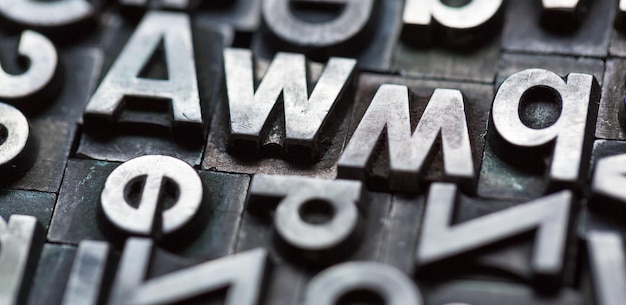
Typography is easy to overlook because it feels like a detail.
In reality, it affects almost every moment a visitor spends on your website. It influences whether a page is easy to read, whether the design feels professional and whether the tone of the business feels right.
The best typography rarely shouts for attention. It helps the content do its job.
Readability comes first
The most important job of text is to be read.
A font can be stylish, distinctive or fashionable, but if visitors have to work hard to understand it, it is the wrong choice for body copy. This matters even more on mobile, where screen space is limited and people are often reading quickly.
Choose fonts with clear letter shapes, comfortable spacing and enough contrast against the background. Avoid using decorative fonts for long passages of text.
Keep the number of fonts under control
Using too many fonts can make a website feel chaotic.
Most sites only need one or two typefaces: one for headings and one for body text or a single flexible typeface with different weights. Consistency helps visitors understand the structure of the page without thinking about it.
If you need variety, use size, weight and spacing before adding another font family.
Create a clear hierarchy
Good typography helps people scan.
Headings, subheadings, paragraphs, lists and buttons should each have a distinct role. A visitor should be able to glance down a page and understand what the main sections are about.
If everything is the same size, the page feels flat. If everything is huge, the page feels noisy. A sensible hierarchy guides attention and makes the content easier to absorb.
Pay attention to line length and spacing
Even a good font can become tiring if the layout is poor.
Lines that are too long are hard to follow. Lines that are too short feel broken. Paragraphs need enough spacing to breathe, especially on smaller screens. Line height should give the text room without making the page feel loose.
These small choices have a big effect on whether visitors keep reading.
Make sure text works on mobile
Typography should be tested across screen sizes.
A heading that looks elegant on desktop may wrap awkwardly on a phone. A button label may become cramped. A font that feels crisp on a large screen may feel weak or crowded on mobile.
Check your most important pages on real devices and make sure the reading experience still feels natural.
Think about tone
Fonts carry personality.
A traditional serif can feel established and editorial. A clean sans serif can feel modern and straightforward. A playful display font can work for a very specific brand, but feel wrong for a professional service.
There is no single correct font for every website. The right choice depends on the audience, the content and the impression the business needs to create.
Do not forget licensing and performance
If you use custom fonts, make sure you have the right licence for web use.
Also think about loading speed. Multiple font families and weights can add unnecessary page weight. Only load the styles you actually use and make sure fallback fonts are sensible in case the custom font loads slowly.
Typography should make the page feel easier
Good typography is a quiet kind of design.
It makes the page easier to read, helps the content feel organised and gives the website a more confident tone. When visitors can read comfortably and understand the message quickly, typography is doing exactly what it should.