
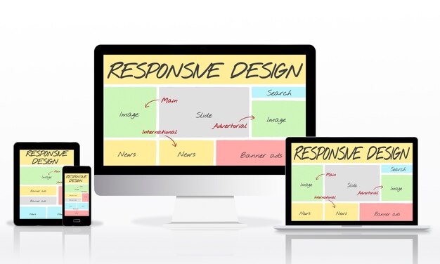
Bootstrap has been around for a long time in web design terms, but it has not disappeared.
It remains a widely used front-end toolkit for building responsive websites and interfaces. Modern Bootstrap is not the only option and it is not always the best choice, but it can still be useful when a project needs consistent layouts and familiar components quickly.
The real question is not whether Bootstrap is fashionable. It is whether it suits the project.
What Bootstrap does
Bootstrap provides a set of ready-made HTML, CSS and JavaScript patterns.
It includes a responsive grid, typography styles, buttons, forms, navigation, cards, modals and other interface components. Instead of designing and coding every basic pattern from scratch, developers can start with a tested system and customise it.
That can save time, especially for admin areas, prototypes, dashboards and straightforward business websites.
Why it became popular
Bootstrap became popular because it solved a practical problem.
Responsive design requires layouts to adapt across phones, tablets, laptops and larger screens. Bootstrap gave developers a common structure for doing that, along with components that behaved consistently.
It also made collaboration easier because many developers already understood the same class names and patterns.
When Bootstrap is a good fit
Bootstrap can be a sensible choice when:
- You need to build quickly
- The design is fairly conventional
- The project needs common interface components
- Multiple developers may work on the site
- Consistency matters more than a completely custom visual system
For many practical business sites, those are reasonable priorities.
When to be cautious
Bootstrap is not magic.
If it is used without customisation, a site can feel generic. If unnecessary components are loaded, it can add weight. If the design needs to be highly distinctive, a custom approach may be better.
Modern CSS is also much stronger than it used to be, so not every responsive layout needs a framework.
Keep performance in mind
Any front-end framework should be used thoughtfully.
Load only what the project needs, keep custom CSS organised and test the site on real devices. A responsive website should not only resize neatly. It should also be readable, usable and quick enough for visitors.
A tool, not a strategy
Bootstrap can help with implementation, but it does not decide what the website should say, how pages should be structured or what visitors need.
Good responsive design still starts with content, user goals and clear priorities. Bootstrap can support that work, but it should not replace the thinking behind it.