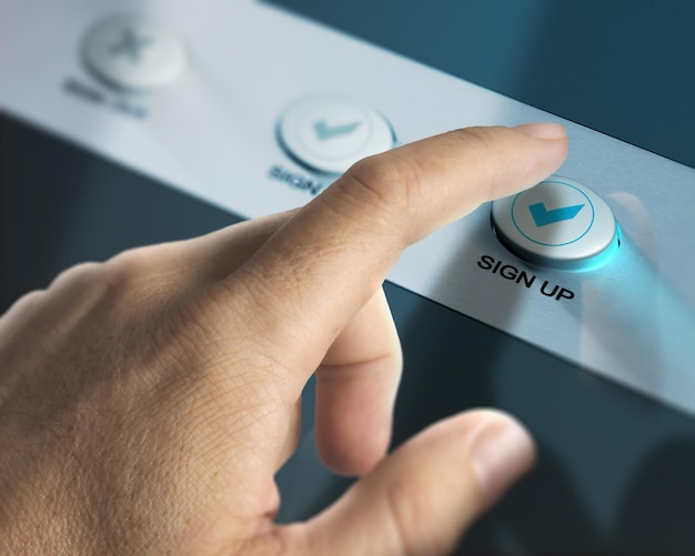
A call to action is the part of a page that tells visitors what to do next.
That might be "Buy now", "Request a quote", "Book a consultation", "Start a trial" or "Read the guide". It sounds simple, but small changes to wording, placement and design can make a noticeable difference to how people use your website.
The best calls to action are not pushy. They are clear, relevant and easy to follow.
Start with the page goal
Before you write the button text, decide what the page is for.
If the page is designed to generate enquiries, the main call to action should point people towards contacting you. If it is a product page, the CTA should support buying or requesting more information. If it is an article, the next step might be a related guide, newsletter signup or service page.
One clear primary action is usually better than five competing ones.
Make the wording specific
Generic CTAs can work, but they are often weaker than specific ones. "Submit" tells people what the button technically does. "Send my enquiry" tells them what they are doing and why.
Try to make the CTA match the visitor’s intent. "Get a hosting quote", "Check domain availability", "Book a website review" or "Download the guide" are all clearer than a button that simply says "Click here".
Specific does not have to mean long. It just has to be meaningful.
Reduce uncertainty
People hesitate when they are unsure what will happen after they click.
If there is no obligation, say so. If a form takes two minutes, say that. If someone will receive a reply from a real person, make that clear.
Small reassurance around a CTA can remove friction. For example: "No pressure, just practical advice" beside a consultation button may be more useful than another sales line.
Put CTAs where they make sense
Do not hide your main CTA at the very bottom of a long page. Visitors should see a relevant next step once they understand enough to act.
For short pages, one CTA may be enough. For longer pages, repeat it at natural decision points, especially after explaining benefits, answering objections or showing proof.
Make buttons look like buttons
A CTA should be easy to spot. Use enough contrast, enough space around the button and wording that fits comfortably inside it.
Avoid making every link look equally important. If everything shouts, nothing does.
Test one thing at a time
If you want to improve conversions, test carefully. Change one thing at a time: wording, colour, placement or surrounding copy. If you change everything at once, you will not know what caused the result.
You do not need an enterprise testing setup to learn from your visitors. Even reviewing analytics, enquiry quality and heatmaps can show where people are hesitating.
Help people take the next step
A call to action is not just a button. It is a signpost. The clearer that signpost is, the easier it is for visitors to move from interest to action.