
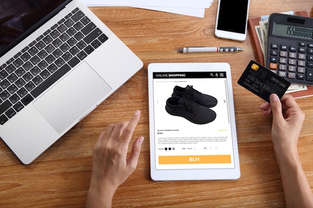
Ecommerce homepages often get a lot of attention, but product pages do much of the real work. By the time someone reaches a product page, they are usually comparing details, checking trust signals or deciding whether to buy. If the page is thin, slow or confusing, that interest can disappear quickly.
A good product page gives the customer enough information to make a confident decision without making the process feel heavy.
Use clear product photography
Images are central to ecommerce because customers cannot hold the product in their hands. Use clear, well-lit photos that show the product accurately. Where possible, include different angles, close-up details and images of the product in use. If size or scale matters, show that too.
For products with colour or style variations, make sure the image changes when the customer selects an option. This reduces uncertainty and helps avoid disappointment after purchase.
Write descriptions that answer real questions
A product description should do more than repeat the product name. Explain what the product is, who it is for, what it includes and what makes it suitable. Include practical details such as dimensions, materials, compatibility, care instructions, delivery information or anything else a customer may need before buying.
Good copy balances benefits and specifics. A vague description might sound polished, but useful detail is what helps people decide.
Make the price and delivery information obvious
Unexpected costs are a common reason for abandoned baskets. Customers should not have to hunt for delivery charges, VAT information, availability or return details. If the final price depends on options, make that clear as the customer selects them.
The more transparent the page feels, the less friction there is at checkout.
Show reviews and trust signals
Reviews can help answer doubts that your own copy cannot. If you collect customer reviews, make them easy to find. A mix of detailed reviews often feels more convincing than a page full of perfect but vague praise.
Where relevant, include product guarantees, secure payment information and clear returns policies. Trust signals should support the buying decision, not clutter the page.
Make the call to action easy to spot
The add-to-basket button should be obvious. It should stand out visually, use clear wording and sit close to the key buying information. Avoid surrounding it with too many competing buttons or distractions.
If customers need to choose a size, colour or quantity first, the page should guide them through that process clearly. On mobile, the main action needs to be just as easy to find and tap.
Improve page speed
Product pages often contain large images, scripts, reviews, recommendations and tracking code. All of that can slow the page down.
Optimise images, avoid unnecessary scripts and make sure your hosting can cope with real customer traffic. A slow product page can affect both user experience and sales, especially on mobile.
Add helpful related products carefully
Related products can help customers discover useful alternatives or add-ons. Keep recommendations relevant. A small number of genuinely useful suggestions is better than a crowded block of unrelated items.
If someone is comparing products, make it easy to understand the difference between them.
Keep testing and improving
Product pages are not something to finish once and forget. Look at analytics, search queries, customer questions and support requests. If people keep asking the same thing before buying, the product page probably needs to answer it more clearly.
Small improvements to product pages can have a direct effect on ecommerce performance because they happen close to the point of purchase.